DESIGN SYSTEM
Building a Design System: One Step Forward, Two Steps Back, Three Steps Forward
My Role
Director
Product Designer
Product Manager
Project Manager
Timeline
2022-2024

Building a Design System:
One Step Forward, Two Steps Back,
Three Steps Forward
The biggest lesson I’ve learned from my experiences in creating design systems is that the work is never done...
A design system is a dynamic entity; it is constantly evolving.
If you ever think it’s finished, all it takes is a new project, feature, or inspiration to reveal just how much more there is to do. This truth shaped our journey at Swing Education—a saga of challenges, pivots, and eventual success in creating a scalable design system.
The Journey: the ups and downs
The Beginning: Tools & Processes
My journey with the design system started as soon as I joined Swing Education. It was myself and two designers working in Sketch, Abstract, and using Zeplin to share designs with Engineering.
While these tools worked well for our small team, they lacked scalability and integration, creating inefficiencies as we grew. We knew we needed a design system—a living, breathing framework to unify our efforts and ensure consistency across our platform.


The first major decision I made was to switch to Figma. This decision allowed us to consolidate our tools and build a stronger foundation for collaboration.
I put together a very quick presentation for Engineering explaining the change. With my team, I outlined how we would organize our files both within Figma and across projects.

Short 6 slide presentation I gave to Engineering explaining why we switched to Figma. The last slide linked to a sample file I created to show how we will be setting up our files at that time.
This setup was not static; we revisited and refined it constantly as our needs evolved.
First Attempt: Ant Design
To kickstart our design system, we leaned on Ant Design, a reactive framework already familiar to our engineers.
While Ant allowed for quick iterations, it lacked the personality and flexibility we envisioned for Swing’s brand. This stopgap measure taught us an important lesson: scalability and alignment across teams matter as much as the components themselves.

The Pivot: Material Design
As our needs outgrew Ant, I proposed adopting Google’s Material Design as a more robust framework. This pivot required buy-in from both design and engineering teams. I created presentations, timelines, and guidelines to facilitate the transition.
But just as we began to gain traction, engineering informed us they were switching to Ionic, a framework better suited for cross-platform mobile and web apps.
This unexpected turn reinforced the importance of communication.
Instead of pushing back, I embraced the change and worked to align design efforts with Ionic’s capabilities by acquiring a Figma kit to expedite the process.
Collaboration thrives on communication—embracing change together is what drives progress.
Enter Front-End Engineers: A Turning Point
In October 2023, the game changed when we hired dedicated front-end engineers experienced in design systems. With their expertise, we were finally able to harmonize our design and engineering efforts. This milestone marked the beginning of true progress, as we refined our components and workflows to reflect Swing’s evolving brand.
Case Study: Building the System
My multi-faceted role
As the Director of Product Design, I spearheaded this initiative, taking on responsibilities that spanned several key functions. I acted as:
-
Director: Providing overall strategic direction and vision for the design system.
-
Product Designer: Contributing directly to the design and implementation of core components and guidelines.
-
Product Manager: Defining the scope, goals, and roadmap for the design system project, ensuring alignment with broader product strategy.
-
Project Manager: Overseeing the execution of the project, managing timelines, resources, and communication between teams.
Key Actions
1. Setting Up the Foundation
Component Tracker
One of our first priorities was creating a detailed component tracker in Confluence. This tool became the backbone of our collaboration, providing clear visibility into the status of components and their dependencies.
While I spearheaded its creation, my team actively contributed to shaping it, ensuring it served the needs of both designers and engineers.
Essential Elements
Defining the foundational elements of the design system was another critical step. Together with my team, I worked through typography, colors, and spacing rules, carefully documenting everything in Figma. These decisions laid the groundwork for a system that could scale with our growing product needs and adapt to future changes.
The essential elements and a tracker that ensures consistency across all components, guiding our creative vision.
 Component Tracker |  Typography |  Colors |
|---|---|---|
 Borders |  Corner Radius |  Padding |
 Breakpoints |  Dropshadow |
2. Front-End Engineering Support
When we began addressing delays, I knew we needed dedicated front-end engineering resources to move the design system forward. Securing this support was a critical milestone, and once onboard, the engineers collaborated closely with our design team to ensure seamless implementation of components.
To keep everyone aligned, we added a weekly meeting to the calendar where we reviewed the tracker together, discussed progress, and resolved any roadblocks. These regular check-ins strengthened our communication and kept the project on track, allowing the team to work efficiently and collaboratively.
.png)
Design + Engineering Collaboration
3. Leading a Collaborative Workshop
The two-day workshop I organized and facilitated in Salem, MA, brought together the design and engineering teams for focused collaboration.
During these sessions, we aligned on:
-
Project goals
-
Defined workflows
-
Prototyped key components.
Beyond the tangible outputs, the workshop was instrumental in building trust between teams, accelerating progress, and fostering a culture of open communication and collaboration.

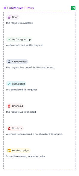
4. Hands-On Contributions
My role wasn’t just about leading from a distance—I worked alongside the team to define and refine atomic components like buttons, inputs, and icons.
By staying involved in the design process, I ensured that the team’s work met our quality standards while providing the support they needed to excel. This hands-on approach reinforced collaboration and kept us aligned on the project’s goals.
A few of my contributions


Outcomes
The project not only delivered tangible improvements but also provided a suite of tools and artifacts that ensured we could continue collaborating and scaling effectively:
-
50% Faster Design Process: The new Design System reduced the time required to create and implement designs by half.
-
Improved Collaboration: The component tracker and workshop fostered stronger cross-functional partnerships between design and engineering teams.
-
Scalability: The Design System provided a foundation for consistent and efficient product updates, reducing redundancy across teams.
-
Team Growth: Team members gained valuable experience, positioning them for future promotions.
Tools and Artifacts
Confluence Tracker: Kept everyone aligned by tracking component progress and dependencies.
Figma File: Centralized hub for guidelines and reusable design components.
Workshop Outputs: Concrete plans and prototypes that bridged gaps between design and engineering.
Storybook: Shared library where design and engineering fine-tuned UI components collaboratively.
GitLab: Coordinated design system development with version control and team updates.
Chromatic: Streamlined visual testing to catch inconsistencies early and maintain quality.
Reflection and Lessons Learned
This journey highlighted the importance of adaptability and communication in driving large-scale initiatives. By balancing strategic vision with hands-on contributions, I not only delivered a successful design system but also fostered a culture of collaboration and growth.
The experience reinforced that design systems are not just about components—they are about people, processes, and continuous evolution.